The current situation with silver visualized
Let us give you some very good charts about silver!
Since everyone wants to discuss silver, let us provide charts to provide a brief overview of the situation.
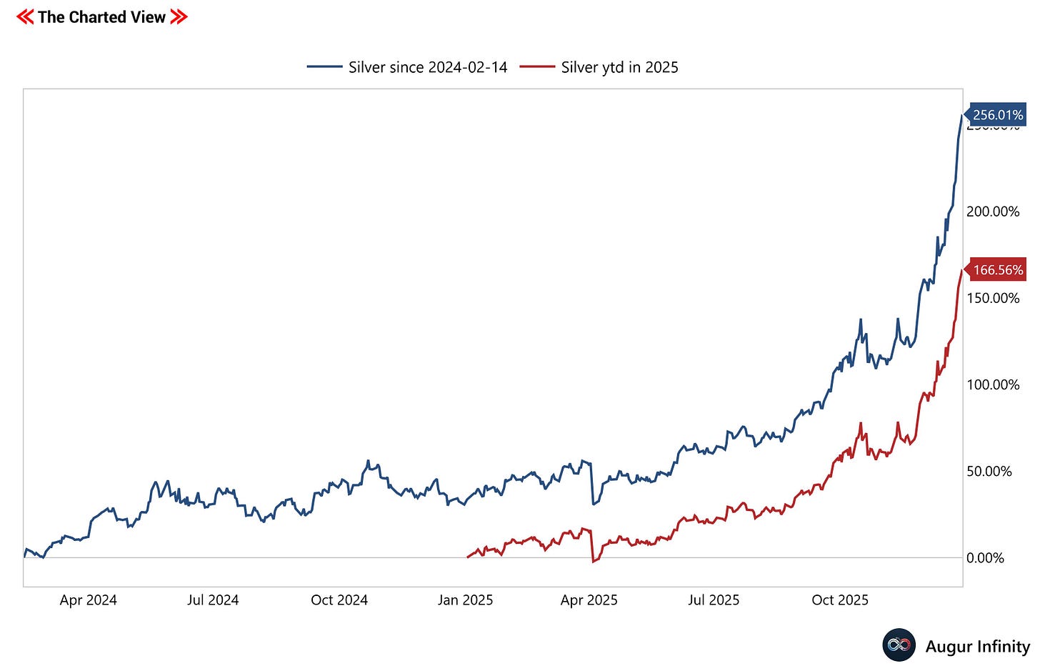
The price of an ounce of silver has been going parabolic in the latest cycle that started on 2024-02-14 and in 2025.
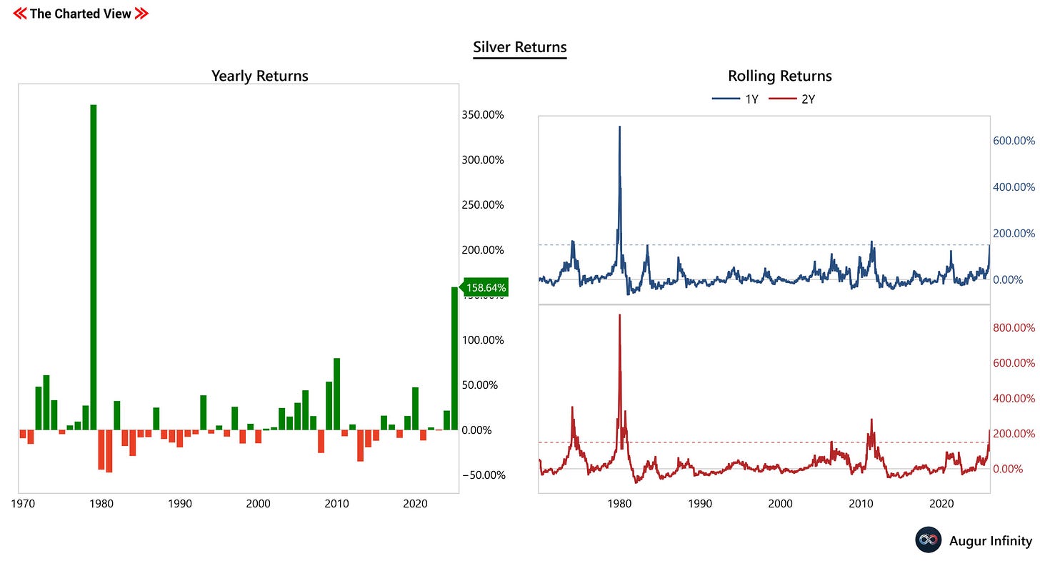
Compared with historical returns, these price changes are rare.
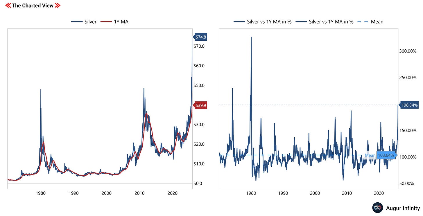
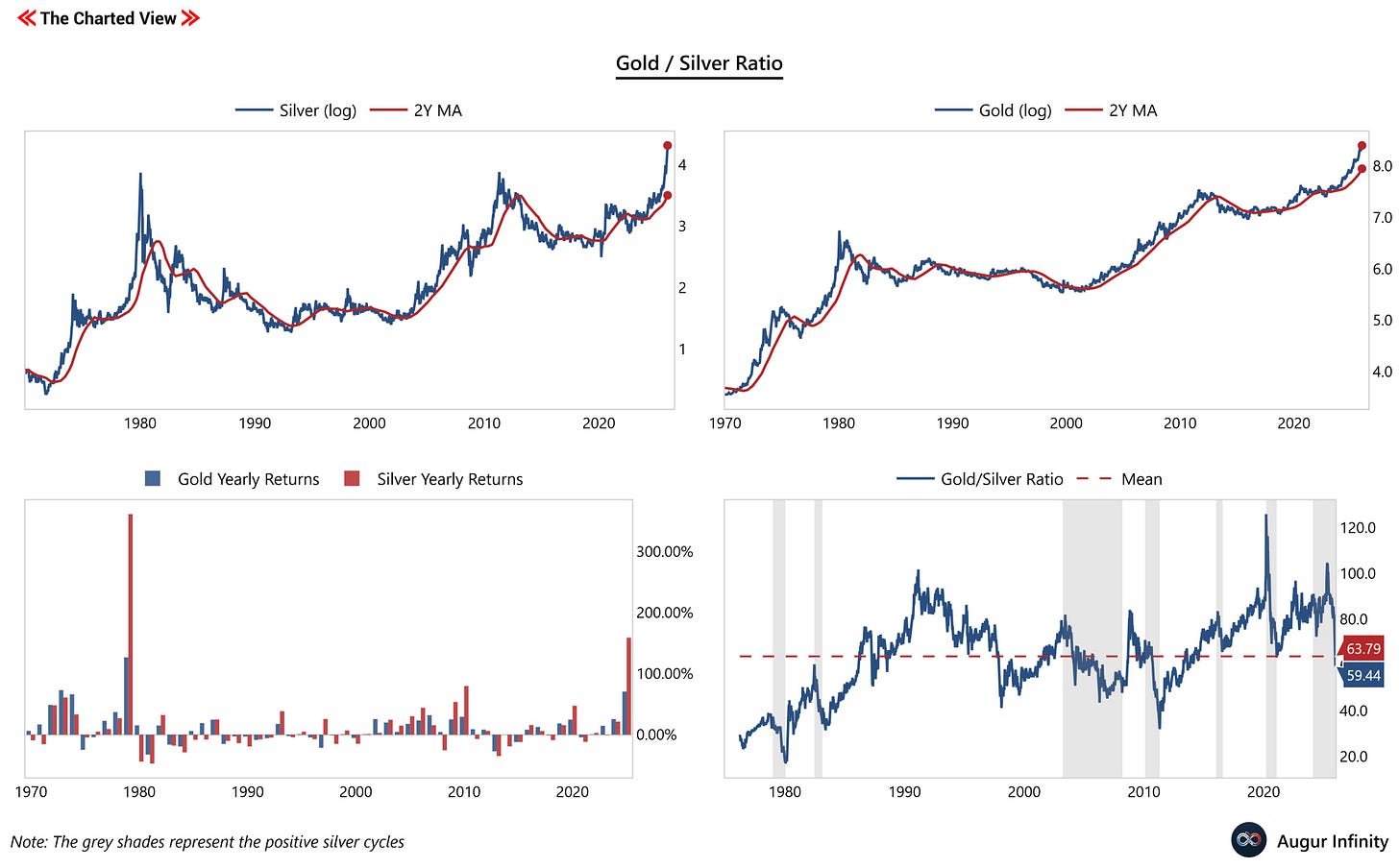
This has brought the technicals to a level even more rarely observed. The difference in % between the current price and the one-year moving average (1Y MA) was higher only twice since 1970: 1974 and 1979. This shows that the price has risen (maybe too) fast.
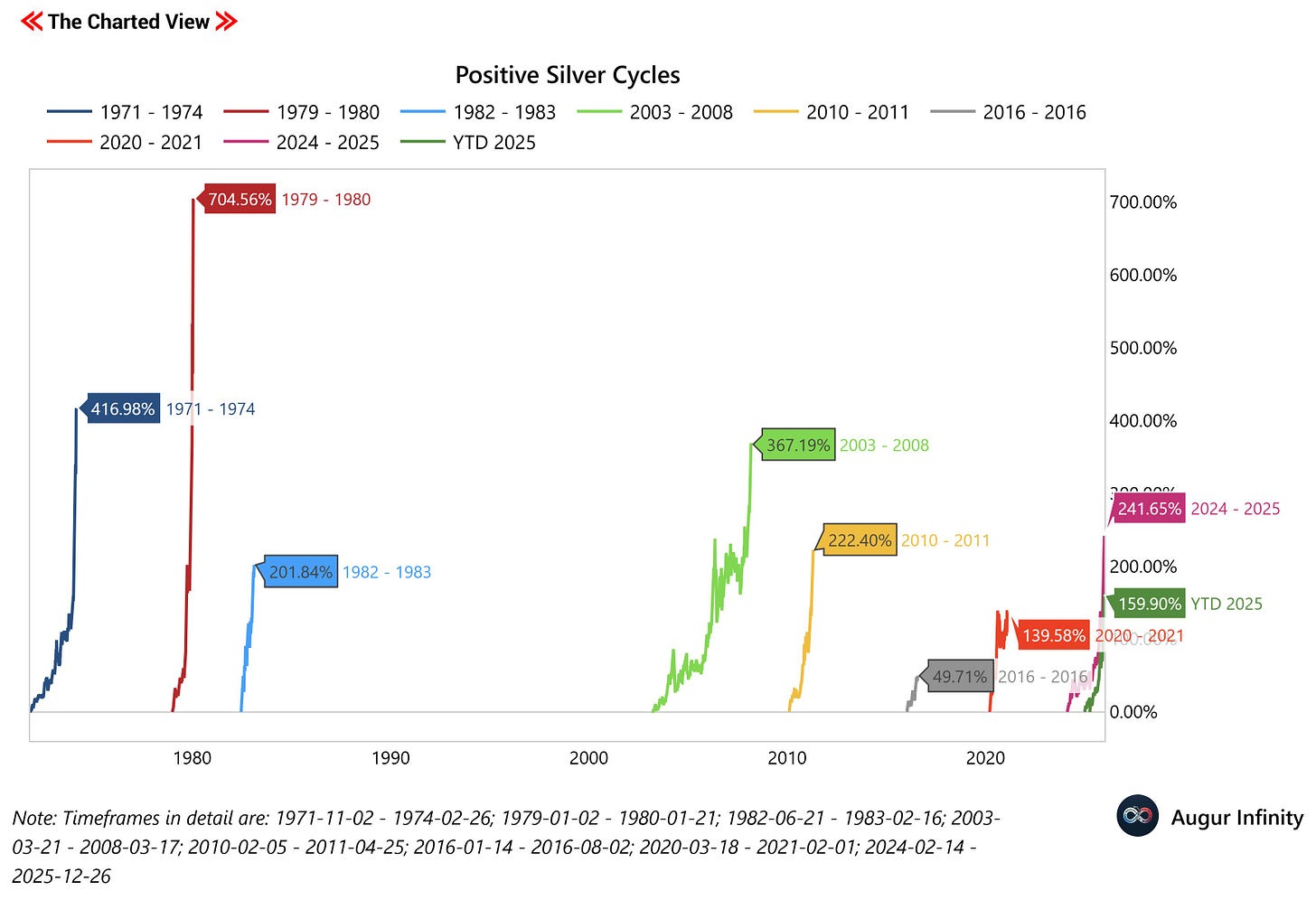
To see how far this can go, we can compare it to historic cycles.
This chart shows the % gains in silver for each cycle from start to end. As you can see, only three cycles boasted higher returns than the current one.
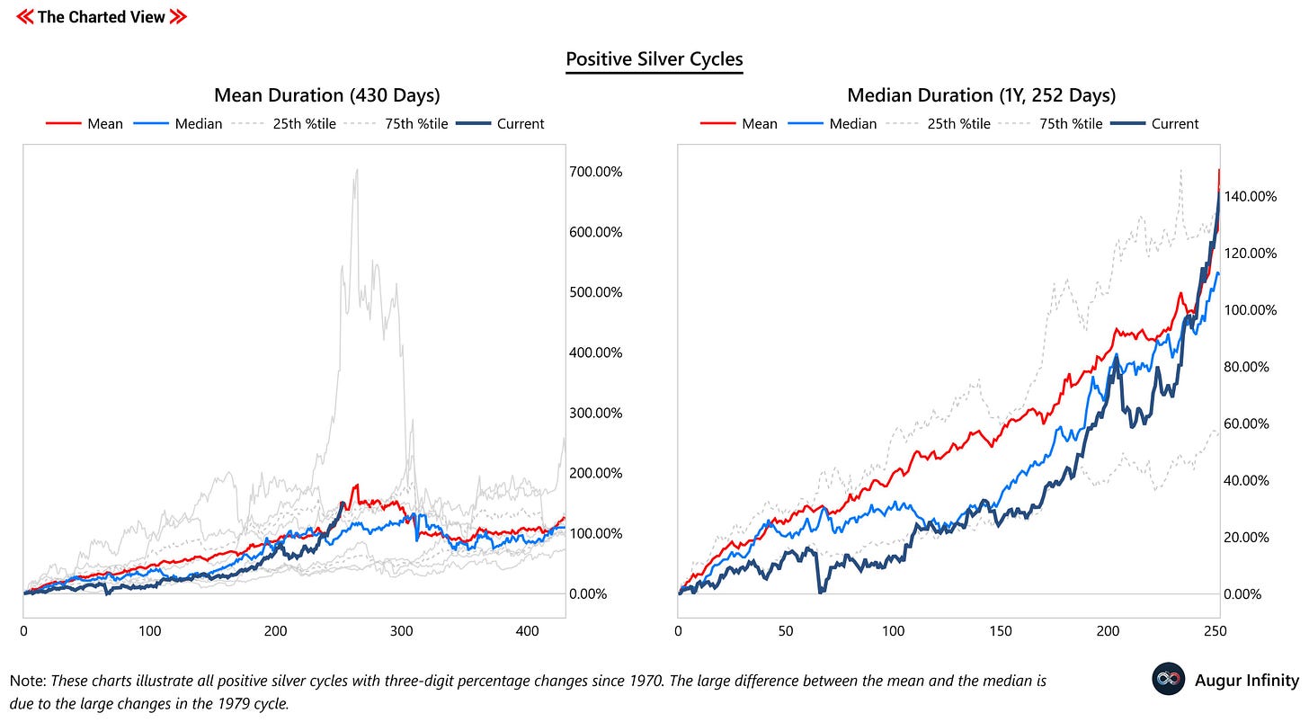
The next chart illustrates the current gains relative to the mean and median of these cycles. The mean duration is 430 days, while the median duration is 1 year. The 'Current' timeseries starts with 2025. Therefore, 2025 is on par with the typical 1-year mean % change for these cycles but ahead of the median, more common performance. Furthermore, on the mean and median levels, the tops of these cycles are close.
Gold, the 'big brother' of silver, usually pulls silver up. According to the gold/silver ratio, the typical pull has already occurred, with the ratio below its average since 1970. However, across all cycles shown, the gold-to-silver ratio was well below the average, indicating greater potential for silver to appreciate. Gold itself could rise further in 2026, but as shown in the chart, it is already up substantially, and there is a risk of a short-term top.
Due to the imbalance of supply and demand, silver can be seen as scarce, which gives it the perfect base to appreciate even more. However, based on the charts above, I would say that the chance-to-risk ratio isn't favorable.


